Stark wrote:Looks fun, good luck!
Thanks, will try my best

!
Hello there!
This week I'm going to make multiple videos and blog posts
! This first one is about the box-art of the game.
https://www.youtube.com/watch?v=kHlTNkQplksBackstory, requirementsFor previous projects I did not spend too much energy on the promotional art. That was obviously a mistake, because usually it is the first thing both the players and the press comes across when checking your game, so it needs to have a good teaser, but it is easy to forget the importance of it and miss allocating time for it...
I planned to make a difference this time, but I significantly underestimated the needed efforts

. I wanted to capture the plot of the game in an image, suggesting the core mechanic, which is trying to collect a lot of loot and having a huge inventory, but still not being enough. All in all I think I succeeded but it took two tries
.
First tryMy first idea was to focus on the protagonist of the game, who is a tomb raider kind-a guy (the not so morally OK one). Not being a typical hero or warrior, I wanted to present him as a bit of a simpleton and not someone who would kill a bunch of monsters with a single slash, since you won't be able to do that in the game either.
Concepting and directionI started out with some concept sketches in my notebook, portraying a bandit/pirate figure carrying huge bags...
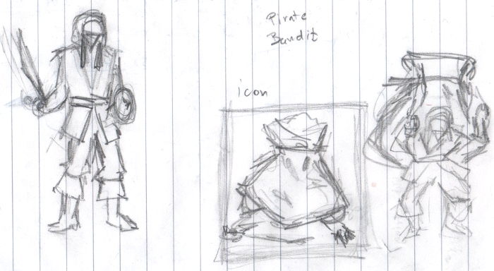
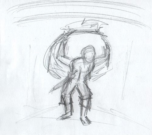
I continued with flashing out this character with a composition I thought I like:

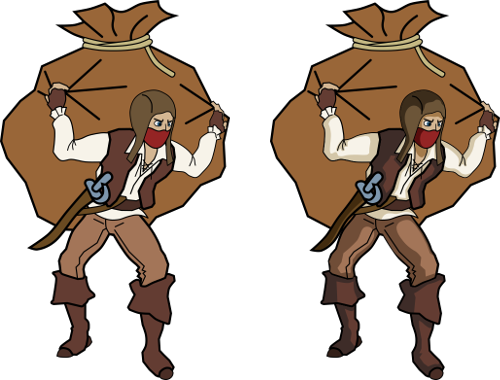
I wanted to create a pixel art end result, because I dislike box-arts with totally disconnected style from the game (except if it is top-notch quality + it adds to the lore of the game) but from my experiences with
Operation KREEP, I knew I'm going to need a s#!tload of image sizes for promotional art (especially true if you plan to sell the game on multiple storefronts). Steam alone requests 5+ marginally different aspect ratios. So I decided to go with vector art as a base, and fix various sized renders instead of manually doing 3 to 4 different setups pixel by pixel.
Inking, results and confessionI use
Inkscape for vector art. It is a free and cross-platform vector graphics editor, and has a convenient user interface . Perfect for line-art, icons etc...

First batch of line-art and shading work was pretty promising, I grown to quite like the character...
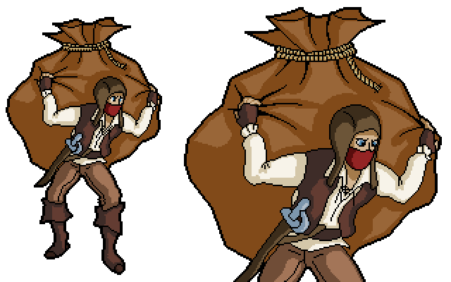
I tried out rendering the character in various sizes and fixing them up in
GIMP using color reduction and manual pixel pushing. I still had "hope" at this point

.
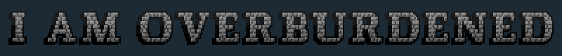
Then I throw together a "placeholder" pixel art title text.
The only thing left, was composition, fine-tuning and polish, so putting together an actual art piece which I could use as the promotional material for the game. Here are my attempts:
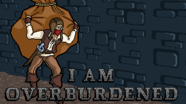
 Of course I made close to a dozen of these, to try out various text sizes, backgrounds etc...
I don't know if anyone likes them, but I sure felt like they simply aren't working. I liked the character, I liked the colors, but the image was lacking detail, a good looking title-text, a correct composition and most importantly somehow it was lacking life

. After days of fiddling on-and-off with it I decided, that no amount of polish is going the fix these problems, so I scraped it and started over!
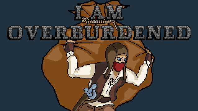
Second tryI wanted to approach the next trial smarter. So instead of jumping in I looked at a lot of reference pictures and lay down much clearer goals and concepts before jumping into producing the picture.
Reference materialLooking at some images made for other games helped a lot! It made me realize, that I have to focus a lot more on the text first and foremost, and a more clever use of both color and space is required for the image as a whole.

I came up with the following concept afterwards which I really liked:
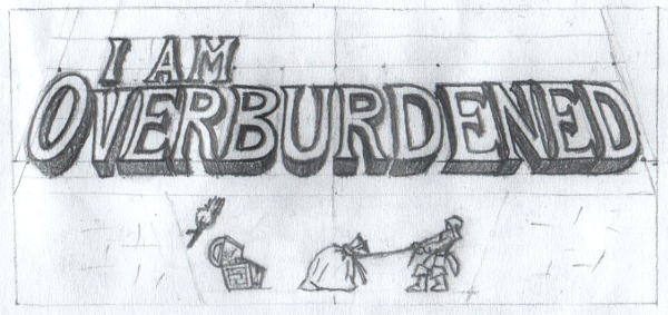
I followed a similar approach for scalability, using Inkscape to create the outline and work from the renders, manually pixeling the final image:
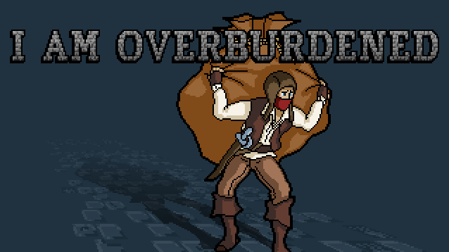
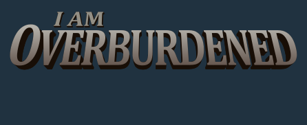 Final, final, final, final!
Funny thing about the final image is, that it took much less time and effort than my first attempt and I think it turned out to be a good deal better looking
.
The takeaway is if you feel even a tiny bit stuck, sit back to the drawing board and spend some more time on your concepts, it will probably yield better results !
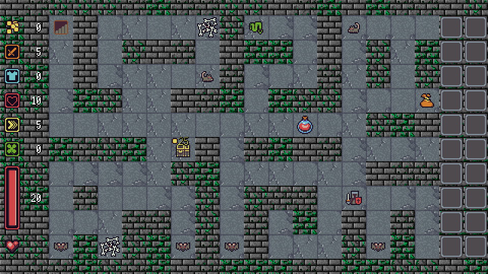
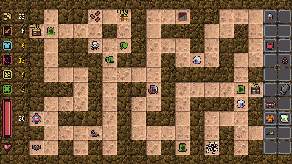
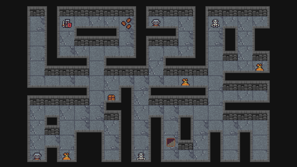
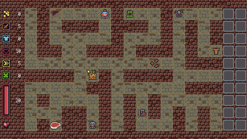
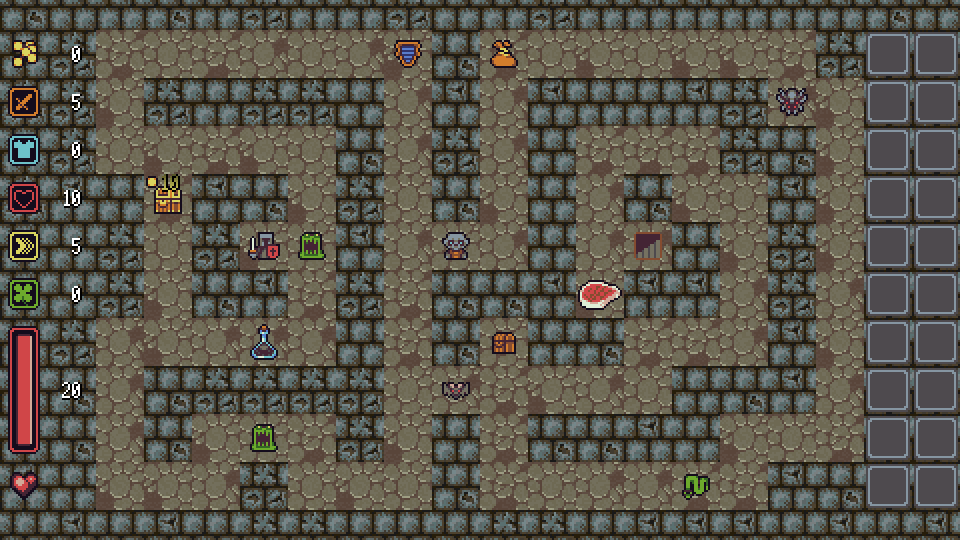
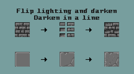
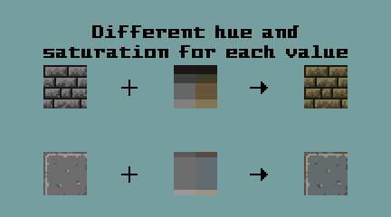
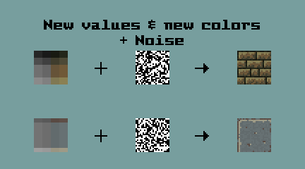
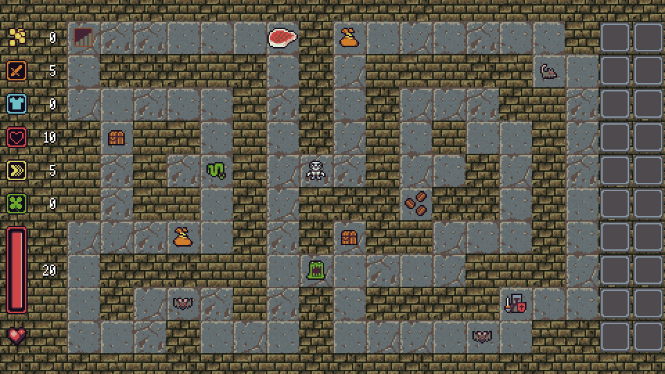
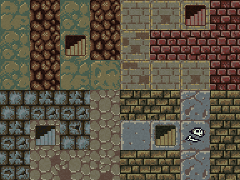
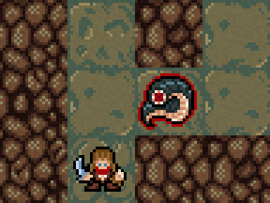
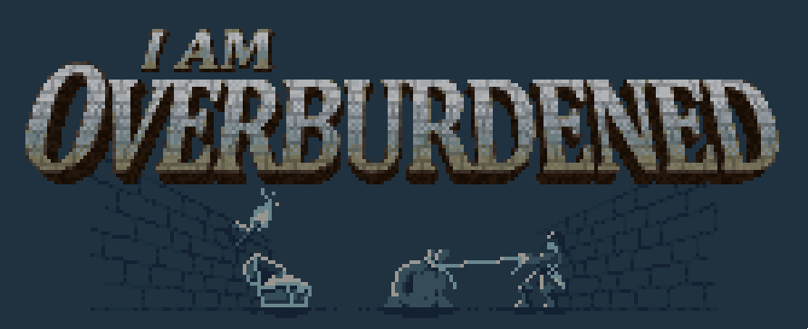
The upcoming entries will be about the linux and mac ports of my previous game Operation KREEP and the tile graphics of I am overburdened. Here is a little sneak-peek of the last one:
Stay tuned!